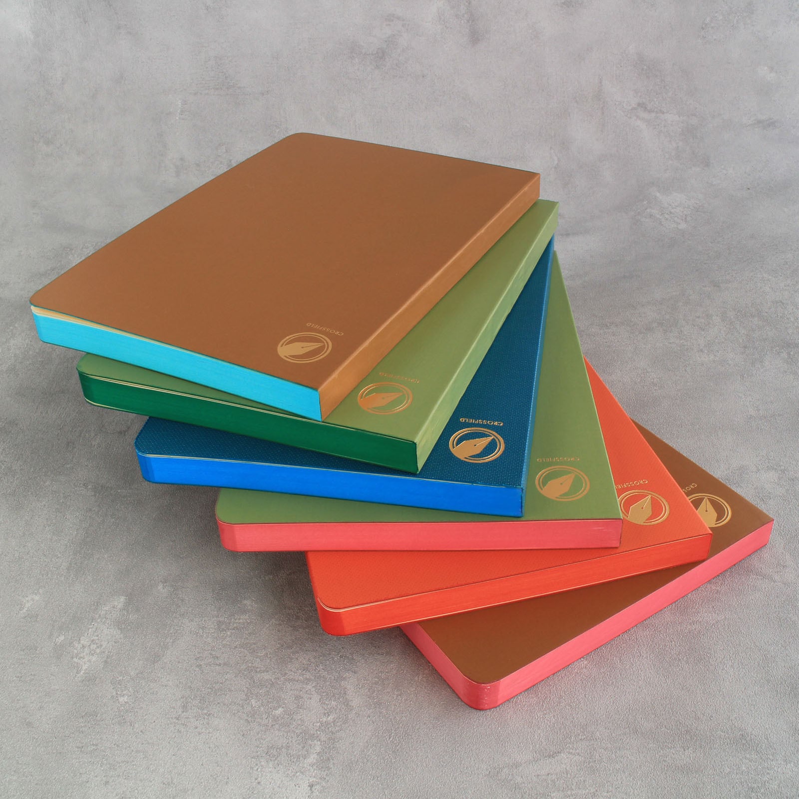
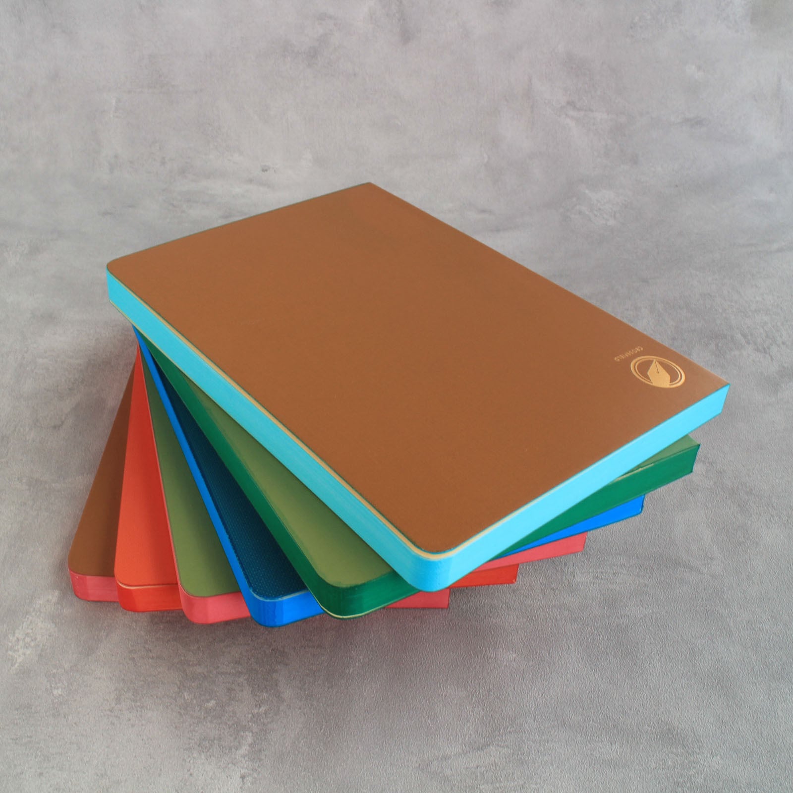
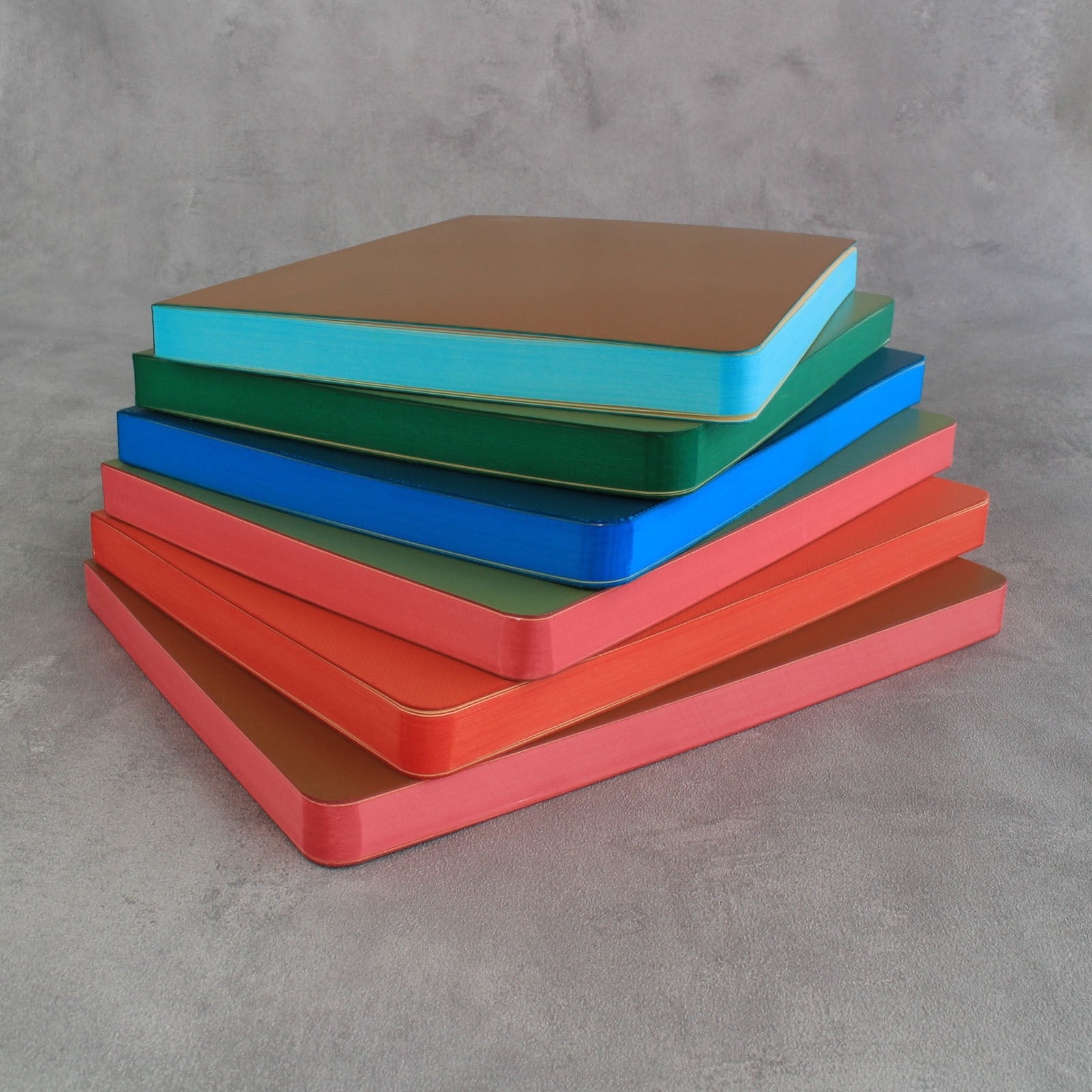
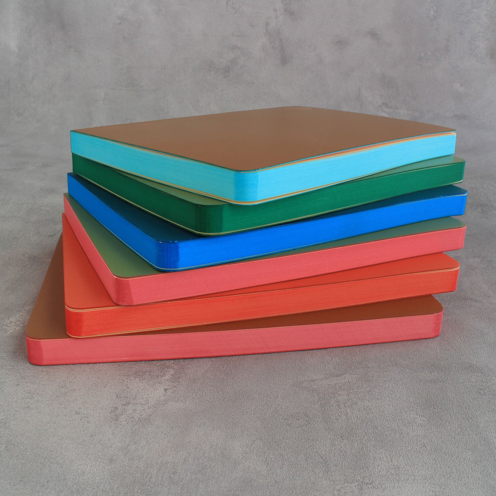
限定版 / 小口色塗り SEVEN SEAS CROSSFIELD / A5
¥4,500
International shipping available
この商品は2点までのご注文とさせていただきます。
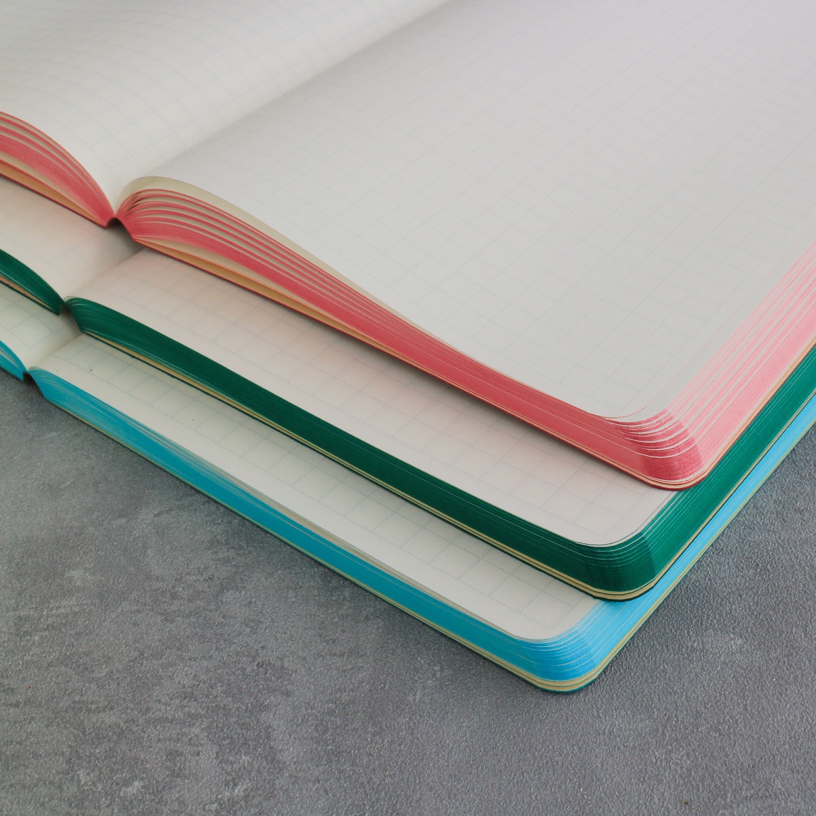
こちらは『Seven Seas CROSSFIELD』に、
製本職人が紙のサイドを刷毛で一冊ずつ塗り上げる
伝統的な装飾技法「三方小口色塗り」を施した限定版です。
A5サイズ・トモエリバー・7mm方眼という
Seven Seas CROSSFIELDの基本仕様はそのままに、
本紙の小口を刷毛で一冊ずつ丁寧に色付けしました。
写真2枚目の番号から、お好みのカラーをお選びください。
This is a limited edition of the Seven Seas CROSSFIELD, featuring hand-painted page edges finished one by one by skilled bookbinding craftsmen using a traditional decorative technique.
While retaining the original specifications of the Seven Seas CROSSFIELD — A5 size, Tomoe River paper, and a 7mm grid — the edges of the pages are carefully colored by hand with a brush, giving each notebook a unique character.
Please select your preferred color using the number shown in the second product image.
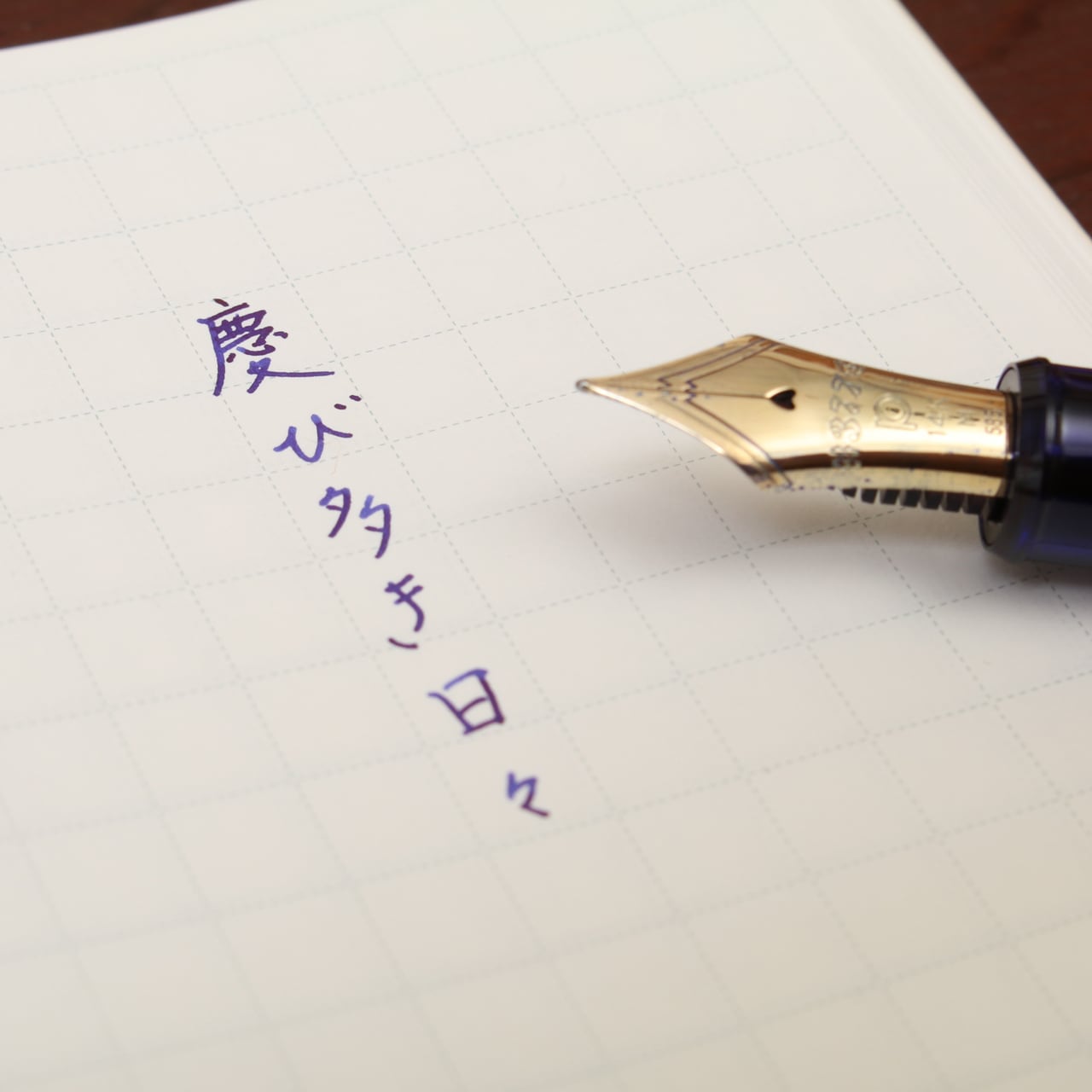
◎万年筆を楽しむために生まれたトモエリバーノート
なめらかな書き心地でインクにじみの少ない用紙「トモエリバー手帳用紙」を使用した、
万年筆で書くことを楽しむために生まれたノートです。
薄くて軽い用紙のため、384ページのボリュームながら厚みはわずか約15mm。
熟練の職人が手作業で1冊ずつ仕上げ、
大容量でもフルフラットに開き、中央付近までストレスなく書き込めます。
画数の多い漢字も書きやすい少し大きめの7mm方眼は、太字の万年筆にも適しています。
Designed for those who enjoy writing with fountain pens, this notebook uses Tomoe River paper, known for its smooth writing feel and minimal ink bleeding.
Despite its 384-page volume, the thin and lightweight paper keeps the notebook to a thickness of approximately 15 mm.
Each book is finished by hand by experienced craftsmen, allowing it to open completely flat and remain comfortable to write in, even near the center of the pages.
The slightly larger 7mm grid provides ample space, making it easy to write complex characters and well suited for broader fountain pen nibs.
【 仕様 / SPECIFICATIONS 】
〈罫線/ Ruling〉7mm方眼 / 7mm grid
〈サイズ / Size〉A5 size (210mm × 148mm)
〈本体厚み/ Thickness〉約15mm / Approx. 15 mm
〈重さ / Weight〉365g
〈ページ数/ Pages〉384 pages
〈素材/ Material〉紙、布 / Paper, Fabric
〈生産国 / Country of Origin〉日本 / Made in Japan
※吸取り紙付き / Blotting paper included
▼「吸取紙」単体での販売もございます
Blotting paper is also available for separate purchase.
https://watanabebbc.buyshop.jp/items/66265979
◆ラッピング対応しております(別途ご購入が必要です)
ラッピングサービスはこちら:
https://watanabebbc.buyshop.jp/items/139817494
◆こちらは、カスタムカットと名入れ箔押しの対象外です。
◆オンラインストアと物販イベント限定の商品です。
■ 製本工房謹製 万年筆のためのノート ■
SEVEN SEAS CROSSFIELDは米国“NANAMI PAPER社”とのコラボレーションで生まれたノートを日本のお客様に向けて使いやすくしたノートです。
こちらのノートは、刷毛で小口色塗りを施した限定版です。
A notebook developed in collaboration with NANAMI PAPER (USA), refined for everyday use in Japan.
Crafted to meet the needs of fountain pen users.
■ 伝統の装飾技術「小口色塗り」 ■

小口色塗りは、本の小口(こぐち)と呼ばれる
紙の断面に色を施す、伝統的な製本装飾技法です。
渡邉製本では、製本職人が刷毛を使い、手作業で丁寧に色付けを行っています。
使用する染料は、その都度調合し、色味を表現。
角丸の部分に至るまで細部に気を配りながら仕上げ、
整った美しさの中に、手仕事ならではの温もりを感じさせる仕上がりです。
■ SEVEN SEAS CROSSFIELDの特徴 ■
◎カリフォルニア発 日本生まれのノート
「トモエリバーノートを製作したい。自国ではこの紙を扱う技術が足りず、ぜひ渡邉製本でお願いできないか。」
カリフォルニアの文具ショップNANAMI PAPERから依頼を受け製作したノート「SEVEN SEAS」。
その日本向け製品がSEVEN SEAS CROSSFIELDです。
以前より日本のお客様からもSEVEN SEASについてお問い合わせや販売のご希望が寄せられていました。ご要望に応え、日本のライフスタイルに合わせたカスタマイズを行い発売となりました。
Originally developed at the request of NANAMI PAPER, a stationery shop based in California.
SEVEN SEAS was created in Japan using Tomoe River paper, and later refined for Japanese users as SEVEN SEAS CROSSFIELD.
◎万年筆愛好家に好まれる「トモエリバー」
するするとなめらかな書き心地、にじみ・裏抜けが少なく万年筆との相性が良い用紙「トモエリバー」を使用。薄くて軽いのも特徴のひとつです。384ページのボリュームながら本紙部分はわずかに15mm程。黒インキはもちろん、カラーインキも美しく発色します。
Uses Tomoe River paper, highly regarded among fountain pen enthusiasts.
Its smooth writing feel minimizes bleeding and show-through (ghosting), while remaining remarkably thin and lightweight.
Even with 384 pages, the paper block is only about 15 mm thick, allowing inks—both black and color—to show beautifully.
◎漢字も書きやすい少し大きめの7ミリ方眼
方眼は画数の多い漢字も書きやすい少し大きめの7mm方眼を罫線に採用しました。
ブルーグレイの罫線はインク乗りの良い破線で構成。適切な濃度で印刷し、筆記時に気にならないよう工夫しています。
Features a slightly larger 7 mm grid, designed for comfortable writing, including complex characters.
The blue-gray dashed lines are printed at a subtle density, providing guidance without distracting from your writing.
◎熟練の製法で仕上げる“Lay-flat Binding”
384ページのボリュームですがフラットに開き、中央付近までストレス無く書き込むことが出来ます。
長年の経験を元に機械加工と手作業双方の良さを組み合わせた“Lay-flat Binding”(レイフラット・バインディング)製法で、熟練の職人が手作業で1冊ずつ仕上げています。
Despite its 384 pages, the notebook opens flat and allows comfortable writing even near the center.
Each notebook is carefully finished by experienced craftsmen using our proprietary lay-flat binding method.
◎長期使用にも耐える素材選び
長期使用での劣化を抑えるため、学術書などに使われる事が多い製本クロス素材で表紙を仕上げています。
カラーは年齢・性別問わずお使いいただける明るめの色を採用。
金のロゴマークは日本の家紋をエッセンスとして取り入れました。
The cover is finished with durable binding cloth commonly used for academic books, chosen to withstand long-term use.
A bright, neutral color and a gold logo inspired by traditional Japanese family crests add a refined, timeless touch.
【ラッピング対応しております】(別途ご購入が必要です)
ラッピングサービスはこちら:
https://watanabebbc.buyshop.jp/items/139817494
-
レビュー
(131)
- レビュー(131)